Author

Tarun
Visit ProfileJump to Topic 👇
◦ Display Flex
◦ Flex Direction
◦ Justify Content
◦ Align Items
◦ Order
◦ Align Self
◦ Flex Wrap
◦ Flex Flow
◦ Video Explanation
Flexbox: The Flexible Box Layout Model ~ Complete Guide
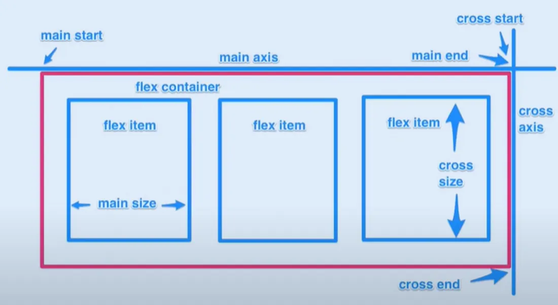
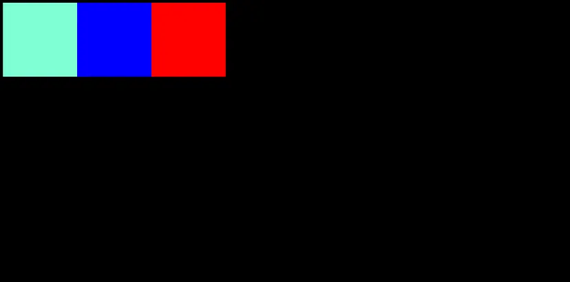
It is a CSS layout mode that provides an easy and clean way to arrange items in a container.
It doesn’t use any float property and it’s responsive, which makes our job easier to position elements.
Display Flex
You can make any container flex by setting its display property to flex:
div {
  display: flex;
}
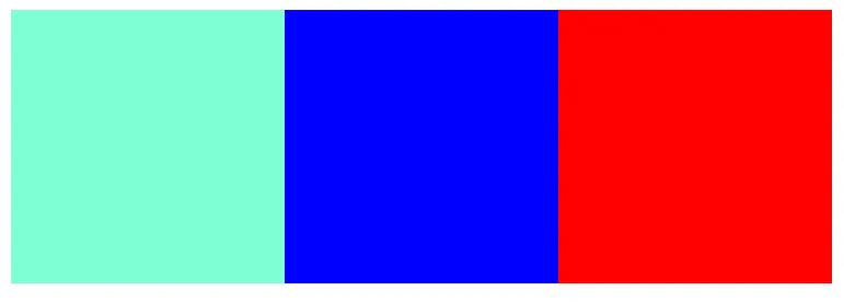
This code will also arrange all items inside the container in a row.
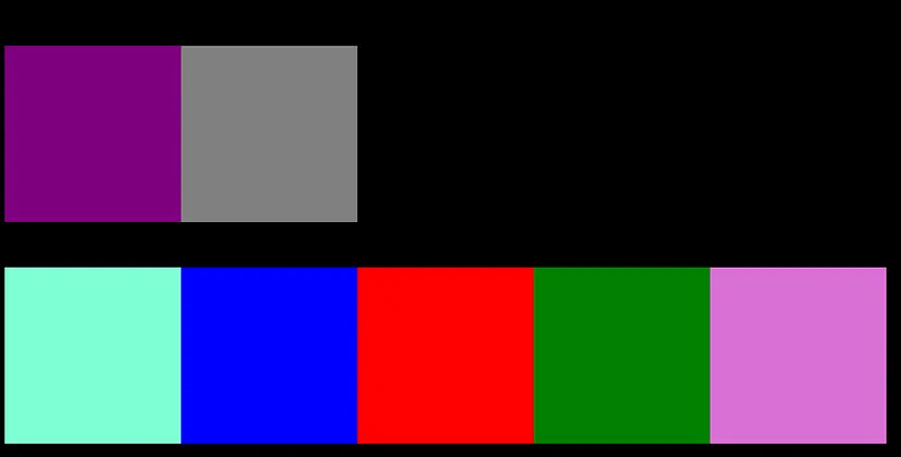
Flex Direction
Don’t worry, you can change the flex direction by using the following property:
div {
  display: flex;
  flex-direction: column;
}
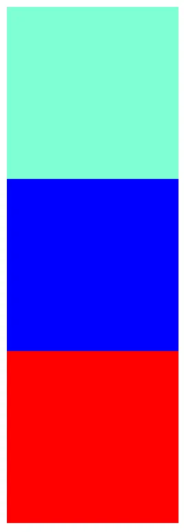
You can select any of these directions:
flex-direction: row;
flex-direction: column;
flex-direction: row-reverse;
flex-direction: column-reverse;
Justify Content
This property aligns items horizontally and accepts the following values:
justify-content: flex-start;
/* Items align to the left side of the container. */
justify-content: flex-end;
/* Items align to the right side of the container. */

justify-content: center;
/* Items align at the center of the container. */

justify-content: space-between;
/* Items display with equal spacing between them. */

justify-content: space-around;
/* Items display with equal spacing around them. */

Align Items
This CSS property aligns items vertically and accepts the following values:
align-items: flex-start;
/* Items align to the top of the container. */

align-items: flex-end;
/* Items align to the bottom of the container. */

align-items: center;
/* Items align at the vertical center of the container. */

Try mixing both justify-content & align-items properties.
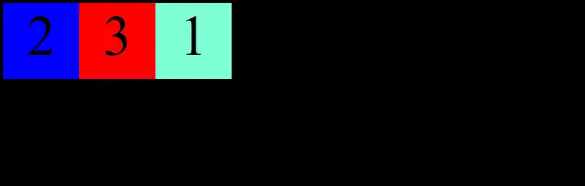
Order
Sometimes reversing the row or column order of a container is not enough. In these cases, we can apply the order property to individual items. By default, items have a value of 0, but we can use this property to also set it to a positive or negative integer value (-2, -1, 0, 1, 2).

order: 2;
Align Self
Another property you can apply to individual items is align-self. This property accepts the same values as align-items and its value for the specific item.

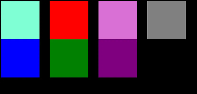
Flex Wrap
The flex-wrap CSS property sets whether flex items are forced onto one line or can wrap onto multiple lines. If wrapping is allowed, it sets the direction in that lines are stacked.
flex-wrap: nowrap;
/* The flex items are laid out in a single line which may cause the flex container to overflow. */
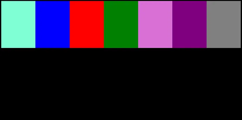
flex-wrap: wrap;
/* The flex items break into multiple lines. */
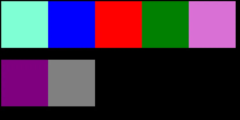
flex-wrap: wrap-reverse;
/* Gives us the opposite output of wrap property. */
Flex Flow
The two properties flex-direction and flex-wrap are used so often together that the shorthand property flex-flow was created to combine them. This shorthand property accepts the value of the two properties separated by a space.
flex-flow: column wrap;
Try finding and playing with more properties of flexbox.
You also have some fun and interesting games to learn flexbox, like Flexbox Froggy & Flexbox Defense, etc.